
Before redesigning an interface, I rarely open Figma. I open the product itself.
One of the biggest mistakes teams make is assuming the solution is to redesign everything. In reality, many usability problems already exist in the current product, you simply have to know where to look.
That's why one of my first steps before any redesign is conducting a Heuristic Evaluation. It helps me identify friction, inconsistency, and usability issues long before a single new screen is designed. It's not the most glamorous part of the process, but it's often where the most valuable insights come from.
Good redesigns don't begin with inspiration. They begin with observation.
What is Heuristic Evaluation?
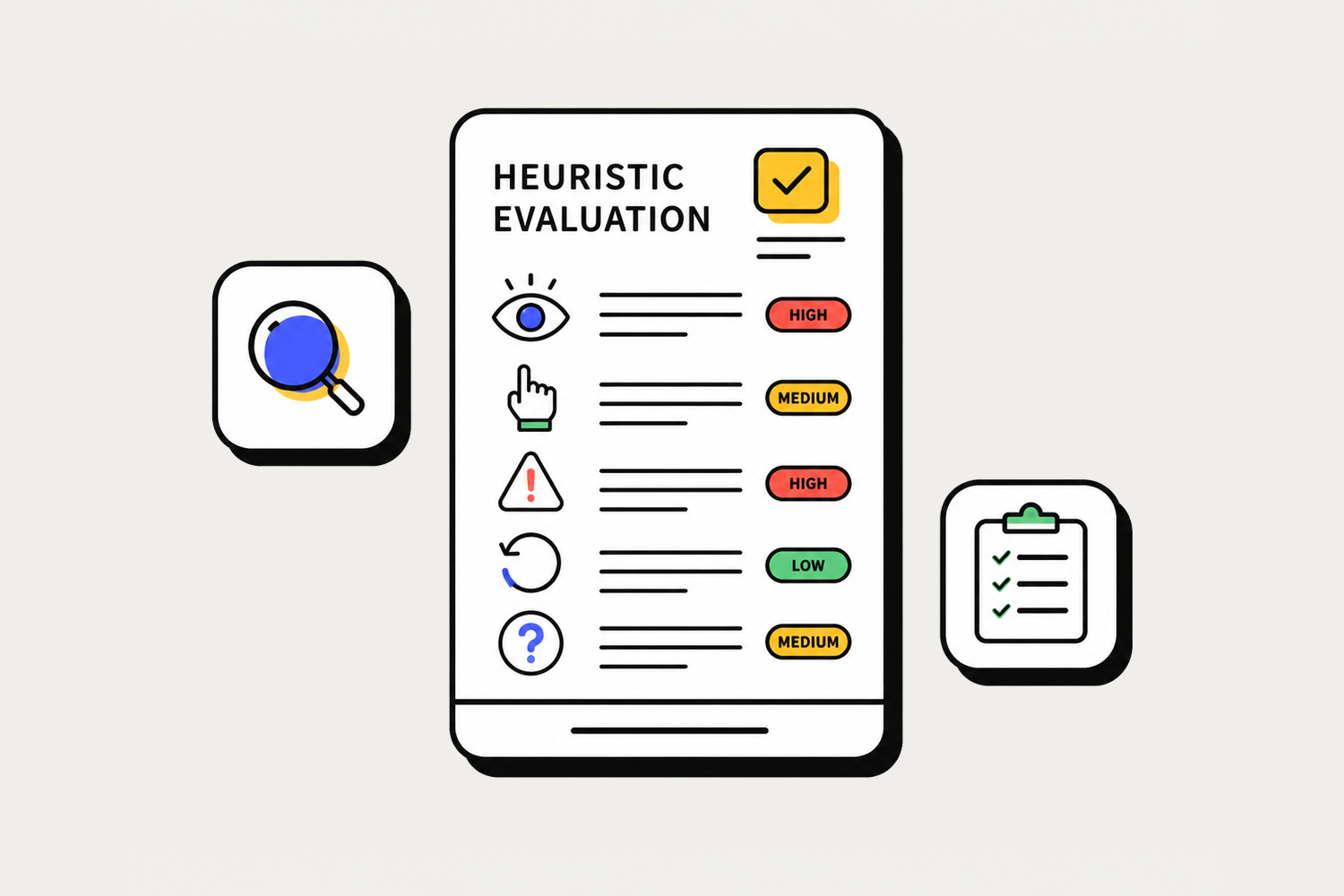
Heuristic Evaluation is a usability inspection method where an interface is reviewed against established usability principles, most commonly Jakob Nielsen's 10 Usability Heuristics. It gives designers a structured way to look at a product critically, without relying solely on gut feeling or personal preference.
Instead of asking users to complete tasks, designers systematically walk through the interface and identify potential problems based on recognized UX principles. It's faster than user testing, and when done well, surprisingly accurate. I've caught issues through heuristic reviews that would have taken months to surface through regular feedback channels.
Why I Use It
After working on enterprise systems for a while, I started noticing that usability problems tend to repeat themselves. Navigation that doesn't match how users think. Buttons that behave differently depending on which page you're on. Important information buried three clicks deep. Actions that give no feedback, leaving users wondering if anything actually happened.
These aren't random mistakes, they're patterns. And once you know what to look for, you start seeing them everywhere. A structured heuristic review gives you the language and the framework to name those patterns clearly, so the team can address them before they become expensive development problems.
The 10 Usability Heuristics
- Visibility of system status
- Match between system and the real world
- User control and freedom
- Consistency and standards
- Error prevention
- Recognition rather than recall
- Flexibility and efficiency of use
- Aesthetic and minimalist design
- Help users recognize and recover from errors
- Help and documentation
How I Usually Conduct a Review
My process isn't about checking boxes. It starts with understanding, the business goals, the user roles, and the flows that matter most. I want to know what success looks like before I start looking for what's broken. From there, I walk through every primary user journey and evaluate each screen against Nielsen's heuristics, one at a time.
Every issue I find gets documented with a screenshot and a severity rating based on how often it occurs and how much it disrupts the user. By the time the review is done, there's a clear, prioritized list of problems to solve before any redesign work begins. That list becomes the foundation, not a mood board, not a trend report, just real problems that real users are running into.
Lessons From Real Projects
During one enterprise redesign, I discovered that the biggest usability issues weren't visual at all. The interface looked fine on the surface, but the moment you started using it as a real user would, the cracks started to show.
Users struggled because similar actions behaved differently across modules. Navigation labels were inconsistent. Information hierarchy shifted from page to page. These weren't problems a prettier UI could fix, and if we had jumped straight into redesigning the visuals, we would have missed all of it.
Having a documented heuristic evaluation made the redesign far more objective. Instead of making decisions based on opinions or gut feeling, every change could be traced back to a specific, real problem. That kind of clarity makes it much easier to align the team and get stakeholders on board.
Key Takeaways
- Always evaluate before you redesign, you might be solving the wrong problem.
- Focus on usability patterns, not personal preference.
- Document findings with severity ratings so the team can prioritize.
- A good UX audit saves far more time than it costs.
"The best redesign isn't the one that looks different. It's the one that removes problems users didn't know how to describe."